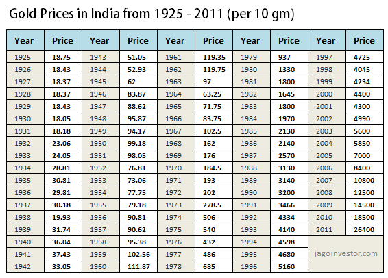
Today I want to show you some patterns of gold prices from last few decades. There is no interpretation or conclusion but some findings and observations on gold price fluctuations in India. From last 10 yrs gold has been on a bull run and prices have multiplied many folds. In the last couple of weeks, gold prices have been extremely volatile and some analysts also predict that gold price upside movement is in threat. So I found gold prices for last 86 yrs (1925 – 2011) and did some number crunching and some graphs from which we get some interesting findings.
4 yrs Gold Price difference (absolute returns
I found out the price difference for every 4 yrs period i.e. from 1928 to 1925 (yrs) and saw what exactly was the difference in the prices, then 1929 – 1926 and so on… till 2007-2011. Just to give you an idea, gold price in 2008 was 12,500 and in 2011 it was 26,400; so the price difference was 111.20%. I used these data to plot a running 4 yrs price difference so at any point of time you can see how much was the return in those 4 yrs prior to that point. Note that this change in absolute in difference. The major point to note is that majority people think that gold has performed outstanding post 2000 in a time frame of 4 yrs. But from the graph you can see that in 70’s time the 4 yrs period return was much more than what investors saw in recent time.

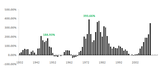
8 yrs Absolute Price difference runnin
This one is just like above chart, but this time its 8 yrs price difference. We are trying to catch that was the price change in an 8 yrs period. So for example, price in year 1980 was Rs 1330, then after 8 yrs – in 1987, the price was Rs 2570, which is a 93.23%… So like this I calculated the price difference for all the 8 yrs period and graphed it. There are very less 8 yr holding period when the returns from gold was negative, that happened 50’s and 60’s and just 90’s end.

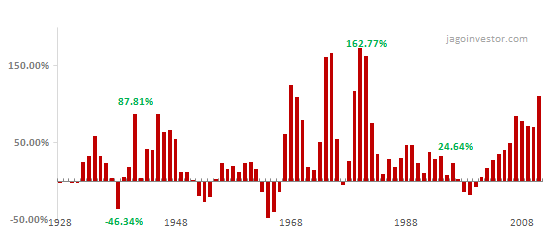
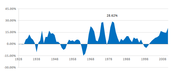
4 yrs CAGR running
The next chart is the CAGR return chart for 4 yrs time frame and the graph is for running periods… that means 1925-1928, 1926-1929… 2008-2011. CAGR return is the main indicator of the performance of any instrument. If you look at the chart below you can see the ups and downs in gold performance and you can see how gold has performed in short run (4 yrs period) for a long time line. You can see that gold returns touched 20%-25% in 70’s and even in recent time it has performed wonderfully… which we all are aware of :).

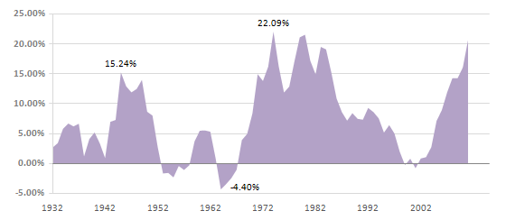
8 yrs CAGR running
Then you can see the graph below which shows CAGR return on 8 yr running period. The interesting a little obvious fact is that it hardly gave any negative return in any 8 yrs time frame, only during 50’s and late 90’s it has performed badly.

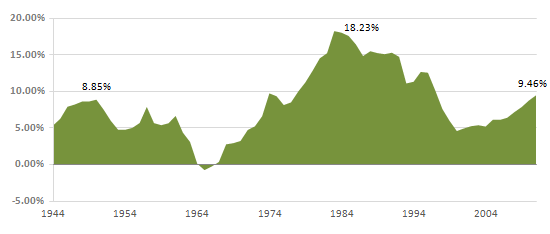
20 yrs CAGR running
The real test of gold comes from a very long term performance and if we see a 20 yrs CAGR return on rolling basis (1925 – 1944, 1926-1945… 1992-2011), then you can see that most of the times the returns has been in the range of 5-10% and only in the 80’s people got best return if they had bought it in 60’s.

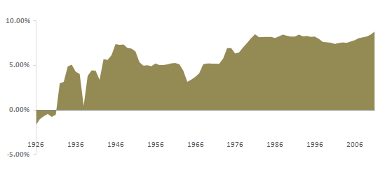
CAGR from 1926 (base year)
This chart is interesting; it calculates the CAGR return of GOLD from 1926 to all the years. I mean CAGR return from 1925- 1926, 1925-1927, 1925-1928 and then 1925-2011… So the base year is always 1925. This shows you what was the very long term CAGR return of gold considering it was bought in 1925. In a way this does not give us very strong conclusion, but still shows us some perspective.

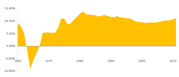
CAGR from 1960 (base year)
This graph is same as above just that the base year taken was 1960 so considering gold was bought in 1960, the graph shows the CAGR return for different holding periods. You can see that apart from those who sold the gold in 80’s realised the best CAGR return, but those who held it for long, still have the returns in range of below 10%.

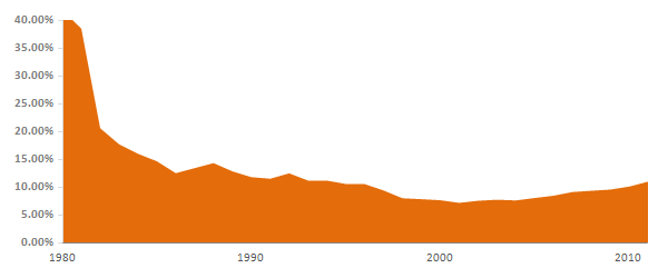
CAGR from 1980 (base year)
The last chart I want to show is with base year of 1980, you can see that over the long term the returns have converged to 10% & only in the last 10 yrs you can see the returns again going up.