The Internal Analysis of Akruti Crash
POSTED BY ON April 22, 2009 COMMENTS (7)
Numbers and Graphs Speak.
I thought of starting my articles from some Analysis on Akruti City Crash .
In this article we will learn , how can we before hand get some idea about events like this and have clear picture of whats going on .
See my previous posts on Warning about Akruti City : Post 1 , Post 2 , Post 3
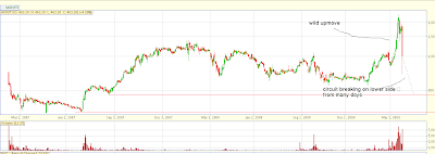
– Lets see 2 yrs old chart first

If you see the chart you will see the steep rise in prices in last month , you can also see that its was not a normal price movement , when compared with previous movements .
For a closer view , lets see 3 months charts

If you see the chart you will see ,that prices moved up crazy and then crashed in two stages .
First Downmove : This happened because of the news that SEBI is excluding it from F&O segment . (If you dont know F&O , dont worry) .
Second Downmove : Second downmove came near 25-26 Mar , when it was F&O expiry . What happened ? Lots of positions were built up in F&O and after a sharp upmove , everyone rushed to get out as fast as they can , at any price . So selling pressure came in and prices tanked 45% .
See High Volumes in the month of March (3rd half of the graph) . Suddenly there was so much participation . Most of the buying which was happening on this stock was not for long term basis (delivery basis) .
What is Delivery Basis : delivery buying means , people actually get the stock in there demat accounts , it simply means its delivered physically to there account , But when you buy in the morning and sell the stock in evening , then its not delivery basis . you just make profit or loss same day .
Lets understand an important concept called “Deliverable Percentage” , which simply means , percentage of shares out traded shares which are actually delivered .
So if its higher , it means that most of the buying and selling is happening for delivery basis and people want to keep it with them for some time , When its too low , it means lot of trading (speculation) is going on to catch the pie in the price movement and hence its not sustainable most probably .
Example :
So , for some XYZ company , if volume is 100 shares and and deliverable % is 50% , it means that 50 shares where delivered and 50 were speculated , which is normal ..
But if its 20% or 10% , then things are fishy , there is no value buying happening and shares are just exchanging hands from one to another where each one wants to sell it at higher price , also there are people who want to buy the shares at higher price , because they know that there will be some idiot who will buy from them at much higher price to continue the madness .
And when it ends then what happens , There are no buyers !! , every one has sold at lower prices and then suddenly the selling madness comes in and the bunch of people who get out first (at higher prices) make the most money . And in this pressure everyone is ready to sell at a lower price than someone else .
You can easily imagine that day price movement , see 26th Mar downmove of 45% crash .
So how do we find out that this is happening , Is there some place we can get data from , and the answers is nseindia.com website , it has all the information on needs to know .
Source : https://nseindia.com/content/equities/eq_scriphistdata.htm
Go here , choose 3rd radio button (Security-wise Price volume & Deliverable position data) , and choose share name and dates for which you want data . You will get all the data .
You must see “Price” , “Total Traded Quantity” , and “% Dly Qt to Traded Qty”, you will get good idea at looking it .
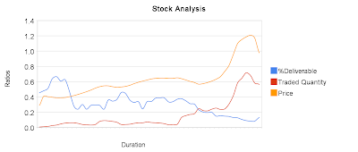
But I will not leave you with boring looking numbers . I have taken the AKRUTI data for 3 months (Feb 1 – Mar 27) and then smoothed it with 5 period moving average for each of them and then plotted it on graph , so that you can get the picture pretty well .
The points do not represent the actual value , it only shows you the relationship of each other . see the below graph .
If you enlarge the chart , you will see this relationship
Price : Prices picked up and start moving up . (Orange line)
Traded Quantity : You will see how it started moving up wildly and picked up a pick high speed in March (3rd half portion) (RED line)
Deliverable % : you will notice that it started going down and down , which indicated that even though Traded quantity is going up and up , the delivery is not happening , which means lots of speculation , which is an indication of a building of Bubble which can burst anytime .
So whats the learning , If you see Price movement in one direction and see Rising Traded Quantity and falling Deliverable % , you should suspect the move . It is normal to some extent , but an extra ordinary move is truly suspectable .
And whats happening now to Akruti ?
from last some sessions there is no buyer , only sellers are there and from the peak price of 2100 levels , its now down to 380 (at the time of writing) . I had already warned of this long back , dont take it as any success in prediction of stocks 🙂 .
If you see the current Volumes of Akruti , it was 2137 on NSE , where as average volume was at 4.5 lacs !! , Which means that this down move is not supported by volumes , (watch volumes in 2nd chart , you will see nothing) .
Its just the fear of handful traders who have no idea why they are selling . So we can again expect some wild moves on upside in future when prices starts picking up .
Conclusion : When you see prices moving in one direction without any great fundamental change or significant news , You can use the numbers and see there relationship and you will see something which most of the people have no clue about .
Disclosure : I had learned this technique from Mr. Sunil Saranjame blog , timamo.blogspot.com , an excellent market reviewer as per my thinking . So credit goes to him .
Please join jagoinvestor google groups , see the upper right area at the start of the page , I will be sending instant notifications about the post and we can also share options trades there or some other stock trades when there is good opportunity . Also who all have not left there comments/suggestions , please do so on the suggestions/comments post
I also Introduced my self in the last post , see My Introduction


Hi, Nice post, I don’t know if you see this page nowadays.. In case you happen to see this mail of mine, please do let me know where can I historical data, say for the last 5-10 years on NSE stocks using which I can plot and analyze the graphs. Looking forward to your help please. Srikanth S.
YOu can get it at http://www.nseindia.com , but you will have to search for it !
Saleem
You have to get the data and do it yourself , I used google spreadsheets to plot the graph , Just put the numbers and plot the graph 🙂
Manish
Hi Manish,
Nice interpretation about the stock.
Do we have any sites where we can see all these charts ready made.
Thanks.
Saleem
@samh Thanks
@Praveen
Thanks for the compliment , The above method is one thing which people can do them selves and see the internal picture .
I do not do analysis on demand , but this time I will tell you .
If you see long term charts , you will see that there is a breakout from long term resistance and it remained above for some time and now its back in the channel , there is no proper signal as of now .
It would be a
BUY above 61 , target 90-95 , SL : 55
SELL below 42-43 , Target 1 : 35 , target 2 : 20 , SL you have to decide .
Make sure that you maintain SL always , Trades can fail depending on markets mood .
Learn TA , be independent 🙂
Manish
Your work is impressive , move on….
Sir can you tell future of tanala.
great interpretation.